



Gamifying the Selection Process
Gamifying the Selection Process
Gamifying the Selection Process
Master’s Thesis, Case: Hobbly
Role:
UX/UI Designer, UX Researcher
Context:
Master’s Thesis
Collaboration with:
Hobbly Technologies Oy
Duration:
12/2025 - 06/2026
Methods:
User Research, User Interviews, Usability Testing, Prototyping, Thematic Analysis, Questionnaires
Tools:
Figma, FigJam, Figma Make, Google Forms
Background
For my Master’s thesis, I wanted to explore a different side of gamification. I had noticed that gamification is often used to motivate users to return to an application or engage with a product or service. This made me curious about how gamification could instead be integrated into the user experience itself, for example as part of the process of discovering and selecting content, and what effect this could have on the overall experience.
At the same time, Hobbly was exploring gamification as a possible way to improve user retention and activity. This created an opportunity to bring these two interests together. I pitched the idea of gamifying the selection process, which evolved into a card-deck-style element for discovering and selecting hobbies, events, and experiences available through the Hobbly app. I designed the element iteratively and studied its impact on users’ selection process and user experience.
Want to know more? Read the full thesis (in Finnish)

Overview
Hobbly is a mobile app that brings together local hobbies, events, and experiences, allowing users to discover, explore more information, and participate in them through the service.
At the time of my thesis, users could browse activities through card-based listings on the home screen, explore different categories, search by keywords. They could save interesting activities to their favourites and access additional information before deciding whether to participate.
In this project, I used selection process to describe the journey from the need to find something interesting to do, through discovering and exploring different options, to selecting activities and saving them as favourites.
The gamified element was designed as an alternative way to browse and select activities. Users were presented with one activity at a time in a card-deck-style interface and could either like or skip it. Liked activities were saved to the favourites section for later consideration.
Overview
Hobbly is a mobile app that brings together local hobbies, events, and experiences, allowing users to discover, explore more information, and participate in them through the service.
At the time of my thesis, users could browse activities through card-based listings on the home screen, explore different categories, search by keywords. They could save interesting activities to their favourites and access additional information before deciding whether to participate.
In this project, I used selection process to describe the journey from the need to find something interesting to do, through discovering and exploring different options, to selecting activities and saving them as favourites.
The gamified element was designed as an alternative way to browse and select activities. Users were presented with one activity at a time in a card-deck-style interface and could either like or skip it. Liked activities were saved to the favourites section for later consideration.
I wanted to explore whether gamification could support the selection process itself and not just encourage users to return.

The Challenge
Hobbly offered a wide variety of hobbies, events, and experiences across several categories. This meant that users had plenty of options to explore. The content could be searched and filtered in several ways, and saving the most interesting options to their favourites.
I wondered whether there could be a more straightforward, easier and more enjoyable way to discover and select content, and whether gamification could offer a new approach to this. I wanted to find out how it would affect the selection process itself and the user experience, and whether it could make discovering and browsing options more effortless and fun.
The research question that emerged from this was: “How does a gamified element affect users’ selection process in the Hobbly mobile app?”
The Challenge
Hobbly offered a wide variety of hobbies, events, and experiences across several categories. This meant that users had plenty of options to explore. The content could be searched and filtered in several ways, and saving the most interesting options to their favourites.
I wondered whether there could be a more straightforward, easier and more enjoyable way to discover and select content, and whether gamification could offer a new approach to this. I wanted to find out how it would affect the selection process itself and the user experience, and whether it could make discovering and browsing options more effortless and fun.
The research question that emerged from this was: “How does a gamified element affect users’ selection process in the Hobbly mobile app?”
Continue reading
I explored three concepts, each supporting users’ decisions in a different way.
Card deck
Discover and choose options yourself

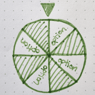
Wheel of fortune
Leave the choice to chance
VS comparison
Compare options to make the final choice

Exploring different concepts
I explored different gamified approaches that could support the selection process. The three concepts below were inspired by familiar gamified elements centred around choice making.
Card deck
Discover and choose options yourself
Wheel of fortune
Leave the choice to chance
VS comparison
Compare options to make the final choice
Exploring different concepts
I explored different gamified approaches that could support the selection process. The three concepts below were inspired by familiar gamified elements centred around choice making.
Card deck
Discover and choose options yourself
Wheel of fortune
Leave the choice to chance
VS comparison
Compare options to make the final choice
Exploring different concepts
I explored different gamified approaches that could support the selection process. The three concepts below were inspired by familiar gamified elements centred around choice making.
Different gamified elements offered different levels of user control and suited different stages of the selection process.
The card deck won because it asked little of users before they could start.

Different concepts, different roles
As I explored the different concepts, I noticed that they offered different levels of user control and required different actions before each could be used. I considered what actions would need to be taken before each element could be introduced and where in the selection process they would fit based on these requirements. This helped me understand how different gamified elements could support different stages of the selection process.
In the end, the selected card-deck-style element was found to be especially suitable for the early stages, as it did not require users to have made previous selections, apart from possibly selecting a category. Instead, users could browse the options one at a time and quickly make decision to like or skip the presented option. These choices were not final, meaning that users weren’t bound by their choices, and the liked options were saved to favourites for later review and decision-making. This made the card deck a potential alternative way to browse Hobbly’s wide range of content, with the aim of making the process lighter, faster and more enjoyable.
Continue reading
Different concepts, different roles
As I explored the different concepts, I noticed that they offered different levels of user control and required different actions before each could be used. I considered what actions would need to be taken before each element could be introduced and where in the selection process they would fit based on these requirements. This helped me understand how different gamified elements could support different stages of the selection process.
In the end, the selected card-deck-style element was found to be especially suitable for the early stages, as it did not require users to have made previous selections, apart from possibly selecting a category. Instead, users could browse the options one at a time and quickly make decision to like or skip the presented option. These choices were not final, meaning that users weren’t bound by their choices, and the liked options were saved to favourites for later review and decision-making. This made the card deck a potential alternative way to browse Hobbly’s wide range of content, with the aim of making the process lighter, faster and more enjoyable.
Continue reading
I mapped the flow first to understand how the experience should work before deciding how it should look.

From Idea to Flow
Once the gamified element had been selected and its role in the selection process clarified, the next step was to design and determine how its logic and flow would work. Where would it start, where would it end, and what steps and choices would be needed in between? The card-deck element was at the centre of the experience, but it also required other stages around it, such as introducing the user to the element, category selection, and a summary of the choices before moving forward.
Based on these considerations, I mapped out the overall flow to examine the different stages and the connections between them, as well as to define what views and functions would be needed at each stage. It also allowed me to consider the outcomes of different choices and check that the overall logic worked before moving on to visual design and prototyping.
Once the overall structure was mapped out, I moved on to designing the high-fidelity views and building a lightweight prototype. The planned flow provided a good framework to work from, while still being refined and adjusted in small ways as the iterations progressed.
Continue reading
From Idea to Flow
Once the gamified element had been selected and its role in the selection process clarified, the next step was to design and determine how its logic and flow would work. Where would it start, where would it end, and what steps and choices would be needed in between? The card-deck element was at the centre of the experience, but it also required other stages around it, such as introducing the user to the element, category selection, and a summary of the choices before moving forward.
Based on these considerations, I mapped out the overall flow to examine the different stages and the connections between them, as well as to define what views and functions would be needed at each stage. It also allowed me to consider the outcomes of different choices and check that the overall logic worked before moving on to visual design and prototyping.
Once the overall structure was mapped out, I moved on to designing the high-fidelity views and building a lightweight prototype. The planned flow provided a good framework to work from, while still being refined and adjusted in small ways as the iterations progressed.
Continue reading

From Flow to Interface
Based on the flow, I identified the key views needed for the process: an introduction to the gamified element, category selection, the card-deck element, and a summary of the user’s choices.
For the first iteration, I used Hobbly’s existing visual style as a starting point, incorporating its colours, typography, shapes, and other UI components to develop a design that aligned with the existing app. I then converted the flow into individual views and explored how the interactions and content would work at each stage.
From Flow to Interface
Based on the flow, I identified the key views needed for the process: an introduction to the gamified element, category selection, the card-deck element, and a summary of the user’s choices.
For the first iteration, I used Hobbly’s existing visual style as a starting point, incorporating its colours, typography, shapes, and other UI components to develop a design that aligned with the existing app. I then converted the flow into individual views and explored how the interactions and content would work at each stage.
The first iteration was kept intentionally simple with one image, one title, and a quick decision.

Iteration 1: Initial concept
The first iteration followed the flow from introducing the gamified element and selecting a category to browsing options with the card-deck and reviewing the selections on the summary page.
Designing the card-deck interaction
I kept the card itself intentionally simple, with the image and title as the primary information. Additional information was limited to tags indicating the category, price, and distance from the user. The aim was to make it possible for the user to quickly evaluate each option without overwhelming them with information.
I also explored how the swipe interaction could work and indicate the user’s choice. Instead of using the more familiar horizontal swipe pattern, I chose a vertical version, where swiping up skipped the option and down swipe liked it. This decision was partly motivated by my interest in seeing how intuitive the interaction would be for users and whether they would prefer the horizontal direction more. Visual feedback during the interaction was provided by heart and X icons together with changes in colour.
The summary view
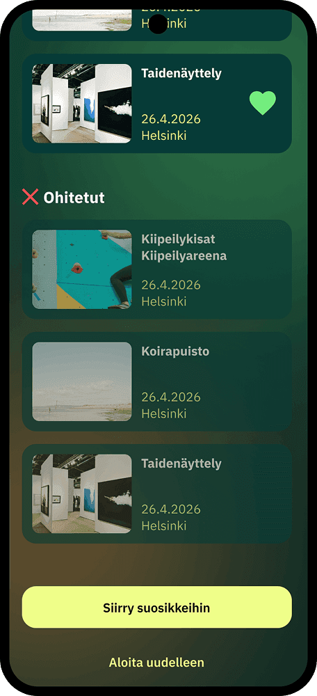
Following the card-deck interaction, the summary view gathered the selections into a card list. Liked and skipped options were visually distinguished, while users could still change their choices before moving on to either starting over, continuing to favourites, or returning to the home page.
Continue reading
Iteration 1: Initial concept
The first iteration followed the flow from introducing the gamified element and selecting a category to browsing options with the card-deck and reviewing the selections on the summary page.
Designing the card-deck interaction
I kept the card itself intentionally simple, with the image and title as the primary information. Additional information was limited to tags indicating the category, price, and distance from the user. The aim was to make it possible for the user to quickly evaluate each option without overwhelming them with information.
I also explored how the swipe interaction could work and indicate the user’s choice. Instead of using the more familiar horizontal swipe pattern, I chose a vertical version, where swiping up skipped the option and down swipe liked it. This decision was partly motivated by my interest in seeing how intuitive the interaction would be for users and whether they would prefer the horizontal direction more. Visual feedback during the interaction was provided by heart and X icons together with changes in colour.
The summary view
Following the card-deck interaction, the summary view gathered the selections into a card list. Liked and skipped options were visually distinguished, while users could still change their choices before moving on to either starting over, continuing to favourites, or returning to the home page.
Continue reading
Hobbly took the initial concept and adapted it to the product’s updated visual identity and refined the experience.

Iteration 2: Hobbly’s Version
The second iteration was created by Hobbly based on my initial concept. The concept was adapted to Hobbly’s updated visual identity, whilst several elements of the original concept were fine-tuned and expanded. This was the version that Hobbly published in the Hobbly app.
Key changes included:
The process start was changed from a pop-up window to a banner accessed on the home page. However, Hobbly later also introduced a timed pop-up window, that appeared once a day after the app had been open for a certain amount of time.
In the categories section, the buttons were redesigned with larger sizes and added icons. A separate “Start browsing” button was also added.
In the card-deck section, X and heart buttons, an exit button (X) and a progress indicator (1/20) had been added to the view. The cards were expanded with additional information about the time and location of the activity, and the way pricing was presented was also changed.
On the summary section a new feature had been added that showed the number of liked and skipped options. The activity options were grouped under their own headings depending on the choices made.
The cards in the summary section had been reduced, with less information displayed on each card.
Continue reading
Iteration 2: Hobbly’s Version
The second iteration was created by Hobbly based on my initial concept. The concept was adapted to Hobbly’s updated visual identity, whilst several elements of the original concept were fine-tuned and expanded. This was the version that Hobbly published in the Hobbly app.
Key changes included:
The process start was changed from a pop-up window to a banner accessed on the home page. However, Hobbly later also introduced a timed pop-up window, that appeared once a day after the app had been open for a certain amount of time.
In the categories section, the buttons were redesigned with larger sizes and added icons. A separate “Start browsing” button was also added.
In the card-deck section, X and heart buttons, an exit button (X) and a progress indicator (1/20) had been added to the view. The cards were expanded with additional information about the time and location of the activity, and the way pricing was presented was also changed.
On the summary section a new feature had been added that showed the number of liked and skipped options. The activity options were grouped under their own headings depending on the choices made.
The cards in the summary section had been reduced, with less information displayed on each card.
Continue reading
This iteration was refined for the user research, adding more visual clarity, more user control, and more consistency with the rest of the app.

Iteration 3: Refining the Concept
Building on Hobbly’s iteration, I refined the concept further before using it for the user research. I focused particularly on adding more visual interest, improving consistency with the rest of the app, adding functionality, and refining the information presented to users.
Key refinements included:
Entry point: The home page banner blended into the background, so to make it stand out, I added a border around it using colours from the app’s visual style.
Category selection: I introduced more colour to the background, which was also carried through to the following sections. The icons were replaced with those used in other parts of the app to enhance visual consistency. I also enlarged the “All” category button to make it visually clearer that it encompassed all the options below it. A cancel button was added as an alternative way to exit the process.
Card-deck section: The background colours were used to support the guidance for the swipe directions. I also grouped the information on the card at the bottom to make it easier to take in at a glance. An additional visual indicator was added to the pricing information to make it clearer whether an activity was paid or free.
Interaction buttons: The X and heart buttons were changed to rounded squares to better reflect the visual language of the app.
User control: A “Save and exit” button, carried over from the first iteration, was added below the interaction buttons to give users more control over the process.
Summary section: I changed the colours of the liked and skipped text in the counts to match the corresponding button colours, making their meaning easier to understand at a glance. I also added matching icons in front of the section headings for additional clarity. The card sizes were increased to improve readability and accommodate the additional information. The activity time and location were added to the cards. The heart icons on the cards were defined as functional buttons that could be used to edit their selections.
This version became the basis for the prototype used in the user research. I built the prototype from the views I had designed in Figma, using Figma Make to support the prototyping process.
Continue reading
Iteration 3: Refining the Concept
Building on Hobbly’s iteration, I refined the concept further before using it for the user research. I focused particularly on adding more visual interest, improving consistency with the rest of the app, adding functionality, and refining the information presented to users.
Key refinements included:
Entry point: The home page banner blended into the background, so to make it stand out, I added a border around it using colours from the app’s visual style.
Category selection: I introduced more colour to the background, which was also carried through to the following sections. The icons were replaced with those used in other parts of the app to enhance visual consistency. I also enlarged the “All” category button to make it visually clearer that it encompassed all the options below it. A cancel button was added as an alternative way to exit the process.
Card-deck section: The background colours were used to support the guidance for the swipe directions. I also grouped the information on the card at the bottom to make it easier to take in at a glance. An additional visual indicator was added to the pricing information to make it clearer whether an activity was paid or free.
Interaction buttons: The X and heart buttons were changed to rounded squares to better reflect the visual language of the app.
User control: A “Save and exit” button, carried over from the first iteration, was added below the interaction buttons to give users more control over the process.
Summary section: I changed the colours of the liked and skipped text in the counts to match the corresponding button colours, making their meaning easier to understand at a glance. I also added matching icons in front of the section headings for additional clarity. The card sizes were increased to improve readability and accommodate the additional information. The activity time and location were added to the cards. The heart icons on the cards were defined as functional buttons that could be used to edit their selections.
This version became the basis for the prototype used in the user research. I built the prototype from the views I had designed in Figma, using Figma Make to support the prototyping process.
Continue reading
I compared the existing and gamified selection processes to understand not only which felt better, but why.

User Research
Research approach
The aim of the research was to understand how the gamified element affected users’ selection process and user experience, and to identify potential improvements based on these findings.
I compared Hobbly’s existing selection process with the gamified version I designed. Participants first tested the original version and then the gamified version, allowing them to compare the two different ways of completing the same task. This was particularly useful because none of the participants had previous experience with Hobbly.
Participants & testing setup
The study included 10 participants aged 18 to 56+. Participants were recruited from my personal network due to the limited timeframe of the study, while aiming to include people of different ages and backgrounds.
In both versions, the participants carried out the same task of finding hobbies, events or experiences that interested them, saving their choices to favourites, and reviewing them at the end. In the gamified version, they also had to find where the process started on the home page.
Participants were asked to think aloud during the testing. I observed their actions, took notes and asked follow-up questions when needed. The testing sessions were audio-recorded, and the sections carried out on the phone were also recorded through screen recordings.
Methods
I combined qualitative and quantitative methods to examine both participants’ experiences and the differences between the two versions.
Methods included:
Usability testing
Semi-structured interviews
Questionnaires & UMUX-Lite
Qualitative and quantitative analysis
Thematic analysis
UMUX-Lite provided numerical and comparable data on perceived usability and usefulness, while interviews, questionnaires and observation helped me understand participants’ experiences and behaviour in more depth.
My role
I was responsible for the research process independently from start to finish. I designed the research setup and tasks, developed the questions, recruited participants, prepared and piloted the testing, conducted the testing and interview sessions, and analysed the collected data. Finally, I compared the results and, based on them, developed recommendations for improvements to the design.
Continue reading
User Research
Research approach
The aim of the research was to understand how the gamified element affected users’ selection process and user experience, and to identify potential improvements based on these findings.
I compared Hobbly’s existing selection process with the gamified version I designed. Participants first tested the original version and then the gamified version, allowing them to compare the two different ways of completing the same task. This was particularly useful because none of the participants had previous experience with Hobbly.
Participants & testing setup
The study included 10 participants aged 18 to 56+. Participants were recruited from my personal network due to the limited timeframe of the study, while aiming to include people of different ages and backgrounds.
In both versions, the participants carried out the same task of finding hobbies, events or experiences that interested them, saving their choices to favourites, and reviewing them at the end. In the gamified version, they also had to find where the process started on the home page.
Participants were asked to think aloud during the testing. I observed their actions, took notes and asked follow-up questions when needed. The testing sessions were audio-recorded, and the sections carried out on the phone were also recorded through screen recordings.
Methods
I combined qualitative and quantitative methods to examine both participants’ experiences and the differences between the two versions.
Methods included:
Usability testing
Semi-structured interviews
Questionnaires & UMUX-Lite
Qualitative and quantitative analysis
Thematic analysis
UMUX-Lite provided numerical and comparable data on perceived usability and usefulness, while interviews, questionnaires and observation helped me understand participants’ experiences and behaviour in more depth.
My role
I was responsible for the research process independently from start to finish. I designed the research setup and tasks, developed the questions, recruited participants, prepared and piloted the testing, conducted the testing and interview sessions, and analysed the collected data. Finally, I compared the results and, based on them, developed recommendations for improvements to the design.
Continue reading
The gamified selection process was perceived to be easier, faster, and more enjoyable, but not suitable for every kind of search.

Results
Key findings
The results showed that the gamified selection process was perceived as a positive and useful addition to Hobbly. Participants found the process easier, faster and more enjoyable than the basic version. The process was also more straightforward, as users did not need to move between different views and tabs to search for and compare interesting activities. Instead, they could browse options one at a time and make quick decisions as they progressed.
The gamified process was also perceived to support concentration and reduce cognitive load. All participants said they would use a similar gamified element again, and some participants went through the process several times.
However, the results also showed that the gamified approach was not necessarily suitable for every situation. For example, it was less suitable when users already knew exactly what they were looking for and needed to find a specific activity.
Measurable impact
The UMUX-Lite results supported the positive findings. Compared with the basic version, the gamified version showed an improvement of:
Overall score: 62 → 79 (+17)
Perceived usefulness: 57 → 77 (+20)
Ease of use: 65 → 82 (+17)
The overall score of 79 approached the UMUX-Lite benchmark for an excellent level of usability, which is 80 (source).
The distribution of individual overall scores also shifted towards higher values. The modes for the basic version were 50 and 75, while the mode for the gamified version was 91.
What worked
The card-deck view was perceived as quick and clear. Showing one option at a time helped participants focus on it, while the large image and concise information supported quick decision-making.
The summary view received particularly little negative feedback. Participants appreciated being able to review their choices and change them before continuing. The visual distinction between liked and skipped options also helped users understand their selections at a glance.
One participant described the experience as:
“This was really simple and easy to use, and in its own way it was much easier to find interesting hobbies or events than having to browse and search for something yourself.”
What needed improvement
The testing also revealed several areas for improvement.
The entry point to the gamified process was difficult to find. Participants took an average of around 50 seconds to find the homepage banner, with times ranging from 4 to 120 seconds. Some participants noticed the banner but interpreted it as an advertisement rather than an entry point to the gamified process. The wording “Swipe and discover” also caused confusion, as it suggested that the banner itself should be swiped rather than tapped to continue.
The vertical swipe interaction was another point of uncertainty. Many participants found horizontal swiping more intuitive because they were already familiar with it from other applications. Most participants relied on the heart and X buttons to make their choices. Participants also wanted more confidence and control over their actions, including the possibility of returning to a previous option if they had made a mistake.
The category selection could also have more precise filtering options. Participants wanted additional filtering options, particularly for location, date and time, and age group. They also suggested that the activities shown in the card-deck could be ordered according to preferences such as distance or time.
In the summary view, participants wanted more flexibility in organising and modifying their choices. Suggestions included sorting the options, for example chronologically, and making the liked and skipped states directly editable through the icons.
Additional insights
The research also raised ideas for extending the concept beyond the tested version. Participants suggested a recommendation algorithm that could learn from their previous choices and provide more relevant options. At the same time, they wanted transparency about how such recommendations would be generated, highlighting the importance of making the recommendation logic understandable to the user.
Another observation concerned the content itself. The research suggested that the relevance of the available activities may have a significant impact on the overall user experience, potentially even more than the interface. The different content shown in the two versions may have influenced how participants perceived them, meaning that the results cannot be attributed solely to the gamified selection process.
This highlighted a crucial factor in designing a smoother browsing experience, which can improve the user’s experience, but the relevance of what is presented stays just as important.
Continue reading
Results
Key findings
The results showed that the gamified selection process was perceived as a positive and useful addition to Hobbly. Participants found the process easier, faster and more enjoyable than the basic version. The process was also more straightforward, as users did not need to move between different views and tabs to search for and compare interesting activities. Instead, they could browse options one at a time and make quick decisions as they progressed.
The gamified process was also perceived to support concentration and reduce cognitive load. All participants said they would use a similar gamified element again, and some participants went through the process several times.
However, the results also showed that the gamified approach was not necessarily suitable for every situation. For example, it was less suitable when users already knew exactly what they were looking for and needed to find a specific activity.
Measurable impact
The UMUX-Lite results supported the positive findings. Compared with the basic version, the gamified version showed an improvement of:
Overall score: 62 → 79 (+17)
Perceived usefulness: 57 → 77 (+20)
Ease of use: 65 → 82 (+17)
The overall score of 79 approached the UMUX-Lite benchmark for an excellent level of usability, which is 80 (source).
The distribution of individual overall scores also shifted towards higher values. The modes for the basic version were 50 and 75, while the mode for the gamified version was 91.
What worked
The card-deck view was perceived as quick and clear. Showing one option at a time helped participants focus on it, while the large image and concise information supported quick decision-making.
The summary view received particularly little negative feedback. Participants appreciated being able to review their choices and change them before continuing. The visual distinction between liked and skipped options also helped users understand their selections at a glance.
One participant described the experience as:
“This was really simple and easy to use, and in its own way it was much easier to find interesting hobbies or events than having to browse and search for something yourself.”
What needed improvement
The testing also revealed several areas for improvement.
The entry point to the gamified process was difficult to find. Participants took an average of around 50 seconds to find the homepage banner, with times ranging from 4 to 120 seconds. Some participants noticed the banner but interpreted it as an advertisement rather than an entry point to the gamified process. The wording “Swipe and discover” also caused confusion, as it suggested that the banner itself should be swiped rather than tapped to continue.
The vertical swipe interaction was another point of uncertainty. Many participants found horizontal swiping more intuitive because they were already familiar with it from other applications. Most participants relied on the heart and X buttons to make their choices. Participants also wanted more confidence and control over their actions, including the possibility of returning to a previous option if they had made a mistake.
The category selection could also have more precise filtering options. Participants wanted additional filtering options, particularly for location, date and time, and age group. They also suggested that the activities shown in the card-deck could be ordered according to preferences such as distance or time.
In the summary view, participants wanted more flexibility in organising and modifying their choices. Suggestions included sorting the options, for example chronologically, and making the liked and skipped states directly editable through the icons.
Additional insights
The research also raised ideas for extending the concept beyond the tested version. Participants suggested a recommendation algorithm that could learn from their previous choices and provide more relevant options. At the same time, they wanted transparency about how such recommendations would be generated, highlighting the importance of making the recommendation logic understandable to the user.
Another observation concerned the content itself. The research suggested that the relevance of the available activities may have a significant impact on the overall user experience, potentially even more than the interface. The different content shown in the two versions may have influenced how participants perceived them, meaning that the results cannot be attributed solely to the gamified selection process.
This highlighted a crucial factor in designing a smoother browsing experience, which can improve the user’s experience, but the relevance of what is presented stays just as important.
Continue reading
A design does not need to be right the first time. It needs to be tested, challenged and refined.
This project showed me that I can take an idea from exploration to a tested design that has a real place in a product.
Reflection
This project gave me the opportunity to take ownership of a complete user research process, from planning and recruitment to testing, analysis and recommendations. It also reinforced my natural design approach which usually involves exploring different possibilities broadly, then gradually narrowing them down towards a solution.
One of the most valuable lessons from this project was recognizing how much a design can benefit from another perspective. When Hobbly developed my initial concept in a different direction, it gave me an opportunity to view the design from a new angle and realise solutions that I might have overlooked. It reinforced my belief that good design grows through collaboration, where ideas are shared, challenged and developed together. At the same time, I was reminded of the importance of being able to explain and stand behind my design decisions while also being open to other perspectives.
User research changed the way I think about users. Participants approached the same tasks in surprisingly different ways, influenced by their previous experiences, expectations and attitudes. This made me more aware of how difficult it is to predict user behaviour based on assumptions alone. I learned to approach research with an open mind and see unexpected findings as opportunities to learn.
Looking back, I would give myself more time for research planning, analysis and developing the proposed improvements. I would also recruit participants outside my own network. Some design decisions in my first iteration, such as the limited interaction options in the card-deck element, are things I would approach differently today. However, these became valuable learning points. They reinforced the importance of an iterative process and that a design does not need to be right the first time. It needs to be tested, challenged and refined.
I am taking my experience in user research, my ability to explore and generate ideas, and my growing confidence in collaboration into future UX projects. Most of all, this project taught me to be more comfortable with uncertainty and to explore, test, adapt and accept that I will not have all the answers from the beginning.
I am proud of what I accomplished. There are things I would do differently today, but I took the project from an initial idea through design, collaboration and user research to a finished concept. The fact that the gamified element was ultimately launched in Hobbly’s app makes the experience especially meaningful to me. It showed me that I can take an idea from an initial concept through design, collaboration and user research to something that has a real place in a product.
Continue reading
Reflection
This project gave me the opportunity to take ownership of a complete user research process, from planning and recruitment to testing, analysis and recommendations. It also reinforced my natural design approach which usually involves exploring different possibilities broadly, then gradually narrowing them down towards a solution.
One of the most valuable lessons from this project was recognizing how much a design can benefit from another perspective. When Hobbly developed my initial concept in a different direction, it gave me an opportunity to view the design from a new angle and realise solutions that I might have overlooked. It reinforced my belief that good design grows through collaboration, where ideas are shared, challenged and developed together. At the same time, I was reminded of the importance of being able to explain and stand behind my design decisions while also being open to other perspectives.
User research changed the way I think about users. Participants approached the same tasks in surprisingly different ways, influenced by their previous experiences, expectations and attitudes. This made me more aware of how difficult it is to predict user behaviour based on assumptions alone. I learned to approach research with an open mind and see unexpected findings as opportunities to learn.
Looking back, I would give myself more time for research planning, analysis and developing the proposed improvements. I would also recruit participants outside my own network. Some design decisions in my first iteration, such as the limited interaction options in the card-deck element, are things I would approach differently today. However, these became valuable learning points. They reinforced the importance of an iterative process and that a design does not need to be right the first time. It needs to be tested, challenged and refined.
I am taking my experience in user research, my ability to explore and generate ideas, and my growing confidence in collaboration into future UX projects. Most of all, this project taught me to be more comfortable with uncertainty and to explore, test, adapt and accept that I will not have all the answers from the beginning.
I am proud of what I accomplished. There are things I would do differently today, but I took the project from an initial idea through design, collaboration and user research to a finished concept. The fact that the gamified element was ultimately launched in Hobbly’s app makes the experience especially meaningful to me. It showed me that I can take an idea from an initial concept through design, collaboration and user research to something that has a real place in a product.
Continue reading
